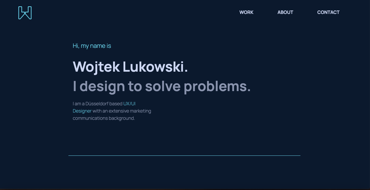
lukowski.io How I have designed and developed my own portfolio site.

Background
As a UX/UI Designer, I want to feature my work online to make it easy for me to present it out and as the same time make it available those who are interested to see it.
My intention was to provide the best viewing experience, regardless of the device it would be viewed on, therefore from the very beginning going for the responsive site has been an obvious choice.
Moreover, I have decided to code my site personally, making it a great opportunity to learn HTML, CSS and the basics of JavaScript.
Tools: Figma, Atom, HTML, CSS, JavaScript, GitHub, Netlify, Google Analytics.
Wireframes
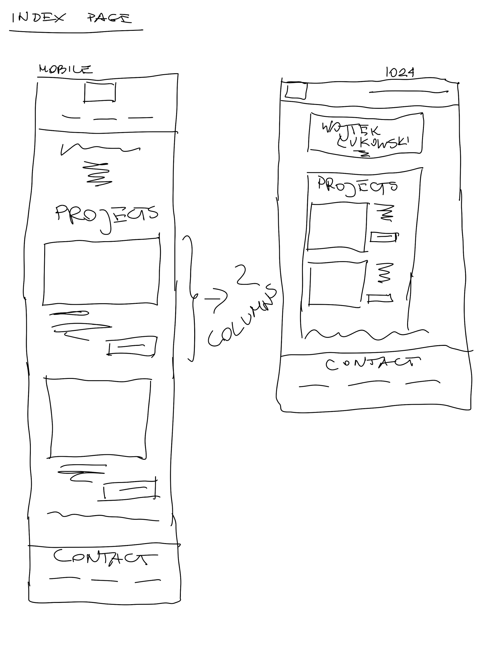
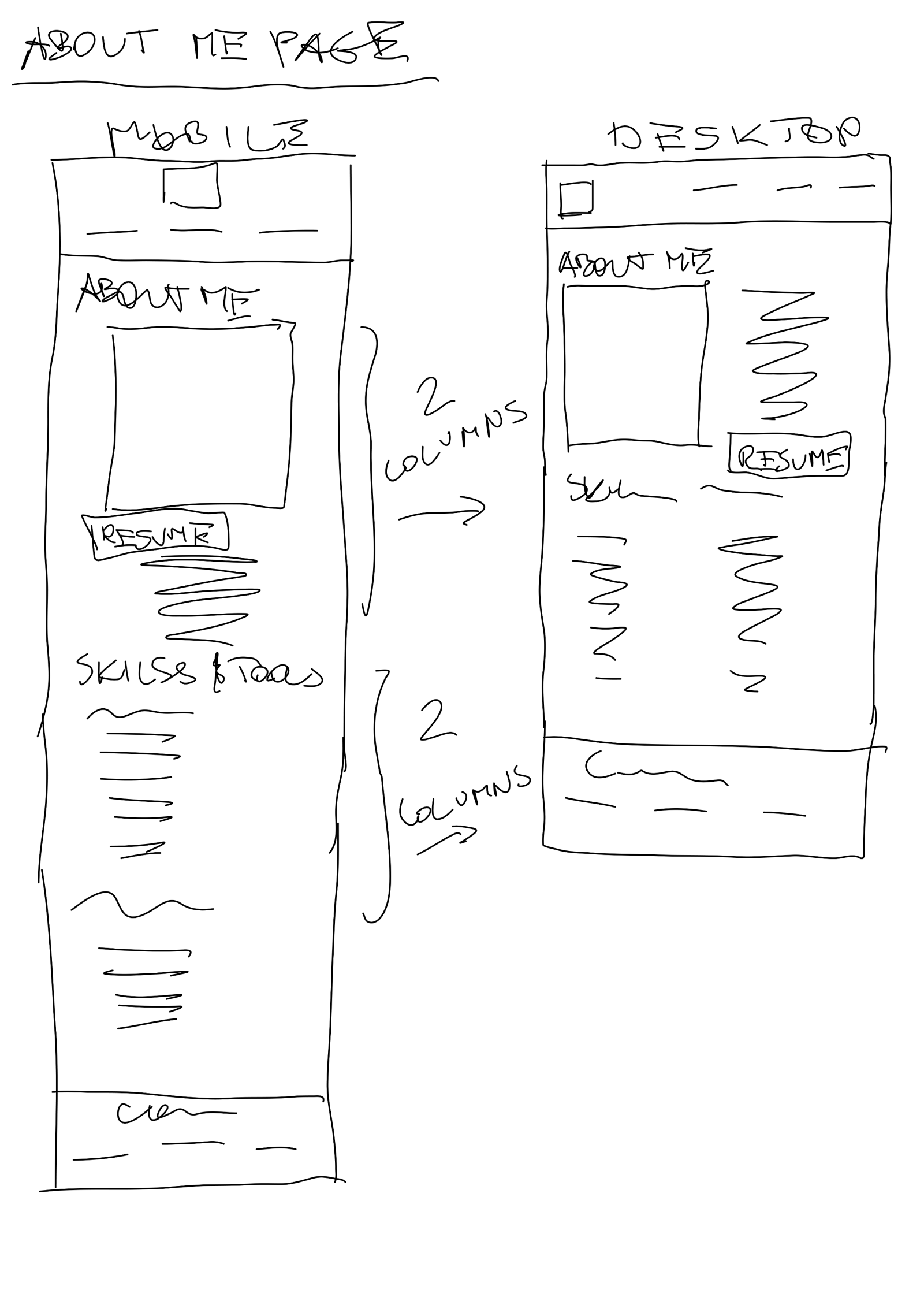
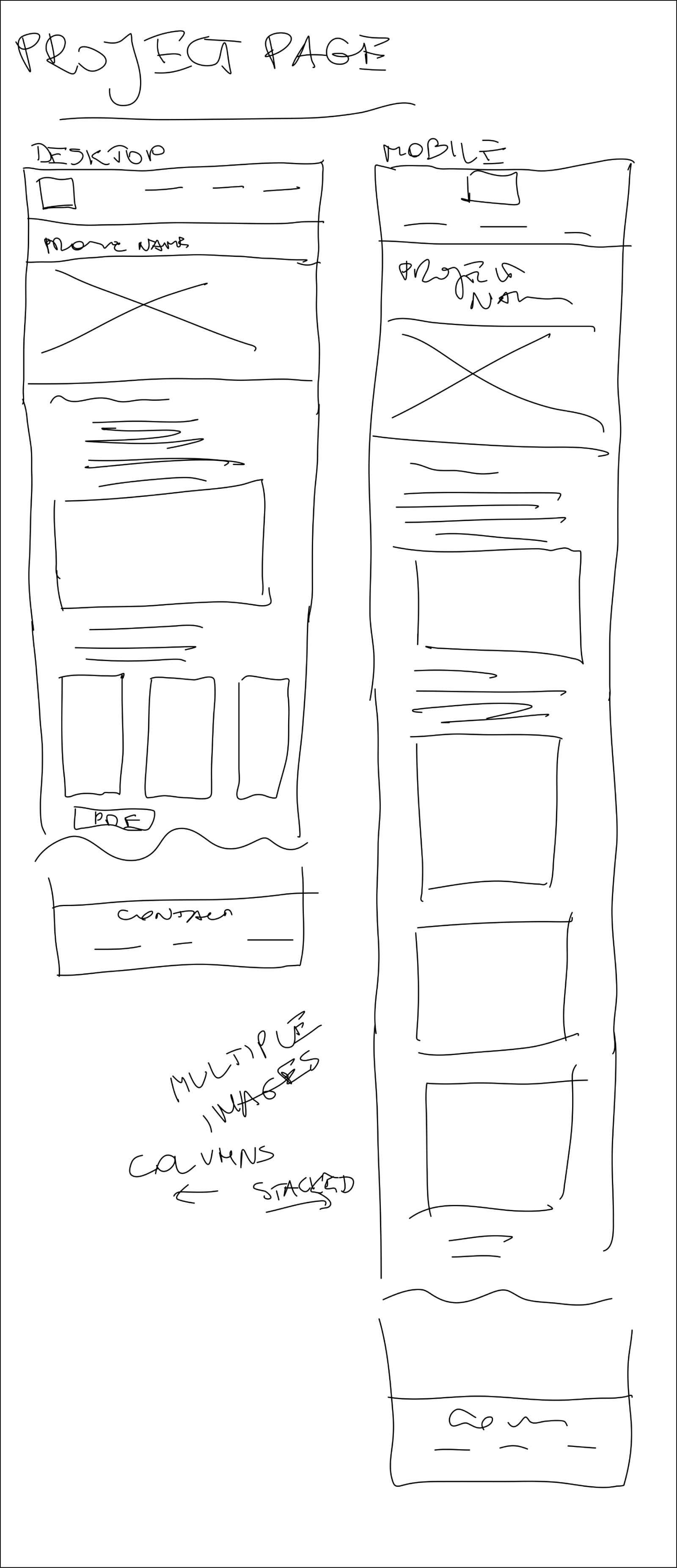
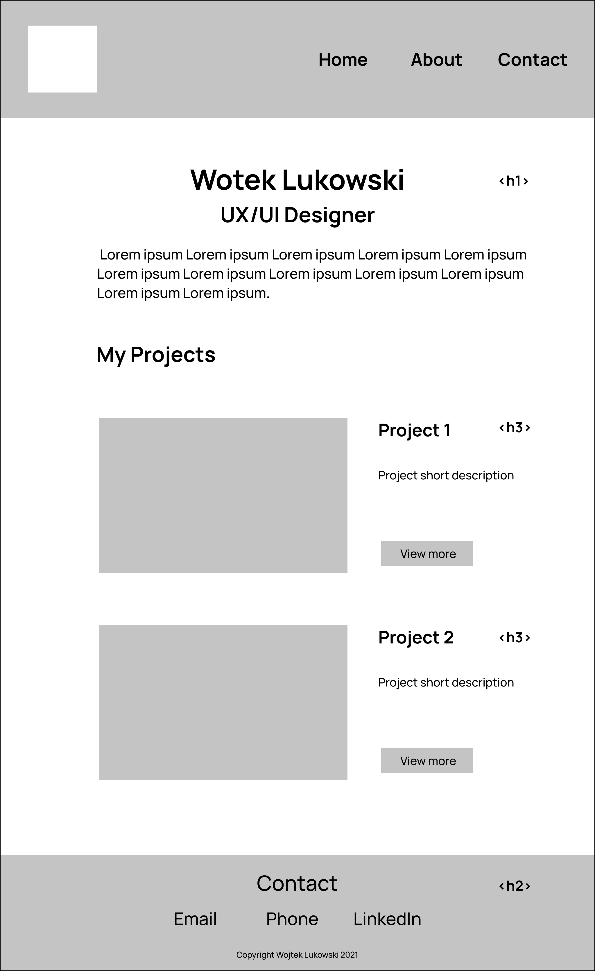
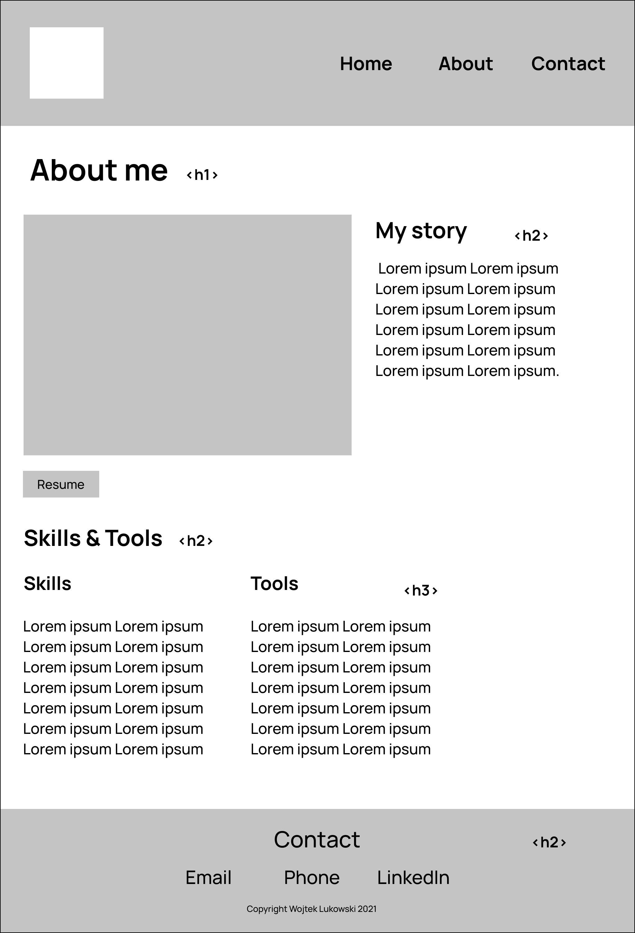
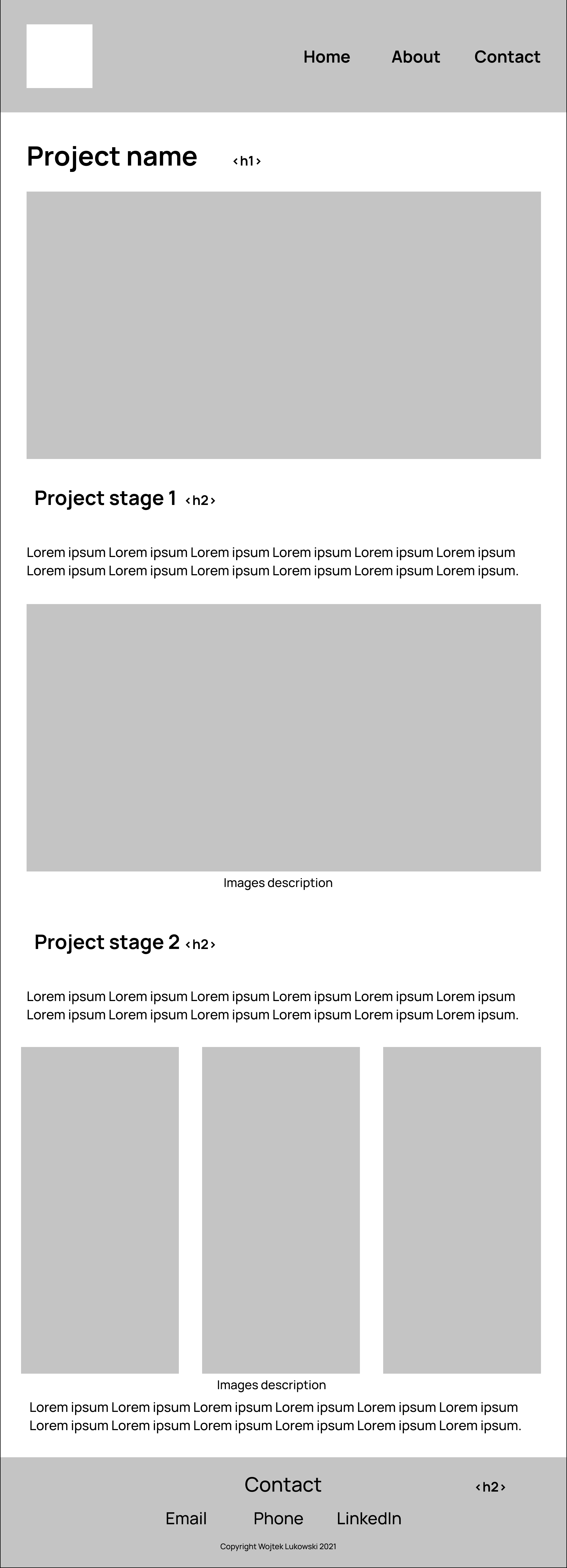
While creating the wireframes, I focused on the fast and easy access to all the important elements of the site (projects, info about me and the contact options) and on the responsiveness of the design.
Lo-fi wireframes
Mid-fi wireframes
Usability study
I have conducted the usability test with five participants (online) and made the following revisions based on the feedback:
- Created anchor links to the project section (from all the pages), so that clicking “work” transfers directly to the projects (before clicking the logo resulted in the same action as clicking the “work” – transferring to the home page (as the project section is on the home page), but the users could not see the projects directly, as they were transferred to the top of the page and needed to scroll down). To keep the structure consistent, I have also decided to change the “about” page into the section of the home page (it was evaluated as being relatively too short to be a separate page).
- Activated the project images in the project sections and the case studies as links, as users tend to click the images (rather than “View more” buttons or the descriptions under the images) when they want either to go to the project page or zoom in/open a pdf.
- Displayed my email address except having the “Email” button, as the automated new email window does not open when e.g. a user is not using/has not configured the email app (also helpful in case somebody would like to see or just copy the address).
- Completely redesigned the graphic style of the site, as it has been evaluated as “very basic and not encouraging to stay on the site” (not really a pure usability issue, but a very important one given the objectives of the site).
Coding & code-testing
The site has been coded with the Atom editor, using HTML, CSS and JavaScript. I also used GitHub for version control and Netlify to put it online.
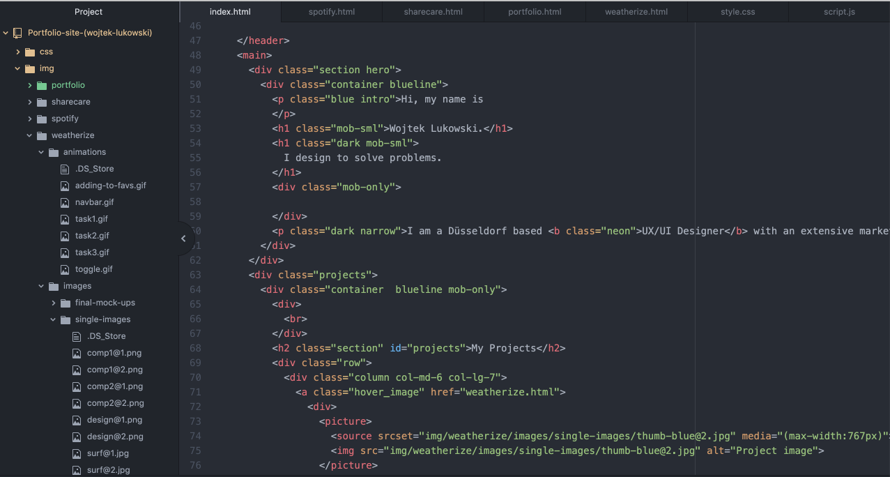
I have tested the site using the W3 Validator and cross-tested it on Chrome, Safari, Firefox as well as iPhone and iPad iOS. The test showed that the "hiding" navigation bar hides when scrolling up to the top position on Apple devices/software (Safari, iPhone, iPad) due to the soft "bounce" back when the page reaches the top position. I have fixed it by adding an additional "OR" JavaScript condition telling to show the navigation bar when the page is up to 50px from the top (even if it is scrolled down at the moment) to the existing condition telling to hide the menu when the page is being scrollerd down.
Finally, I added Google Analytics code in order to see how many visitors I have and what their visiting aptterns are.
The final work
