Weatherize A responsive web app for the water sports enthusiasts.

Background
Weatherize is a responsive web weather app for water sports enthusiasts, designed by me as a sole UX/UI Designer .
Tools: pen & paper, Adobe Creative Suite (XD, Photoshop, Illustrator), Google Forms, Optimal Sort, Usability Hub.
Timeline: 4 months (September-December 2020).
While designing the app, I applied the principles of the User Centred Design Process.
My objective was to design an app that would be simple, easy and give users a fast access to the weather data they want to see. I also wanted it to be different that most of the existing weather apps in terms of its "look & feel".
View the web responsive Frontend Prototype case study.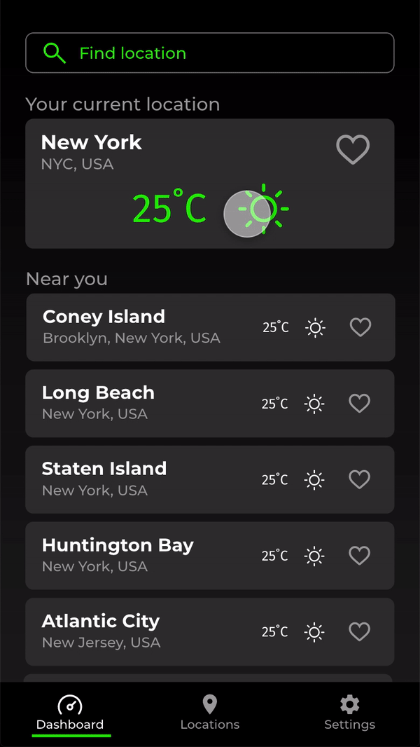

Inspiration
The initial stage of the design process. Its objective is to understand users and their problems, competitors and the market environment. Consists of a competitive analysis and user research.
Competitive Analysis
The first step was to take a look at two water sports specialised weather services: Surfline and WindyApp. This only showed that, although the weather data is very comprehensive, it is presented in a rather complex, unclear and difficult to understand way. Moreover, the "look & feel" and the way the data is displayed is very similar in most of the weather apps (not only the ones I have taken a closer look at).


The User Research Plot
I started the process of understanding my target group with conducting an on-line survey to gather some initial information about the users, their needs and behaviours regarding both - the water sports and the weather apps.
My intention was to use the learnings from the survey to polish the user interview questionnaire, for the interviews which I was planning to run afterwards.
User Interviews
I run three on-line interviews with the following objectives (the full interview questionnaire):
- identify water sports enthusiasts’ general attitude towards weather and (water sports) weather apps and their general usage patterns & habits;
- check some design directions related to features (social media) and design;
- explore the specific insights/findings from the survey and generate new insights to be used during the next stages of the design process.

Affinity Map used to analyse the User Interviews
Research Analysis
I performed the analysis of the interviews using the affinity mapping technique and came up with the insights allowing me to take actionable steps and create the solutions fulfilling users’ needs.
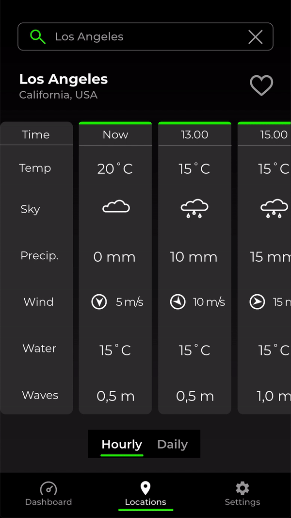
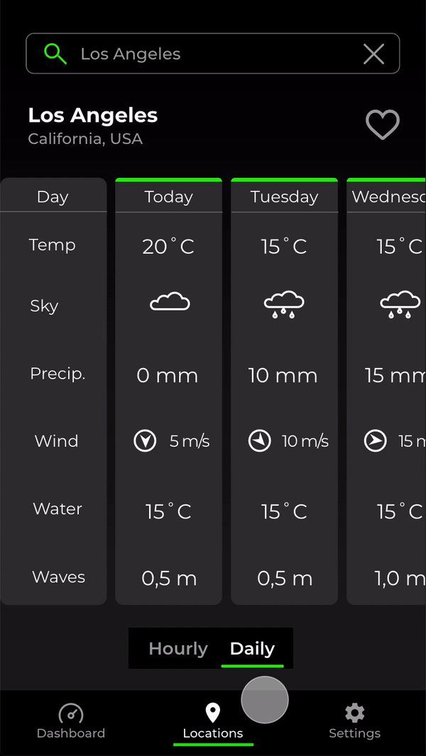
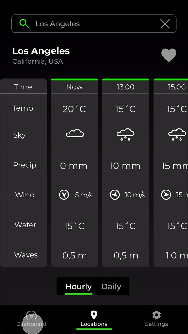
The research showed that all that the users want and need is a simple and not overcomplicated app with a fast access to the most important data, which will be presented in a clear and easy to understand way, so that they will be able to use it "with one finger" even in unfavourable conditions (e.g. on a rocking boat during a heavy rain).
The users also confirmed that most of the apps are looking the same and complicated way, therefore it would be nice to have an app which is different that the others and presents the data in a more user-friendly way.
Further, the research confirmed that my potentia users are a group of very active people, who love to practice their water sports and cannot wait the moment they are out there on the water again, very often regardless of the weather conditions.
Additionally, I have also identified some features that could be considered on the later stages, after the MVP is completed. These could potentially be: live web cams for the locations, possibility of taking a picture with the current weather data and the location displayed or some social features (e.g. chat).
Concepting
The objective of this stage is to look at the future product with the eyes of its future users and anticipating how they are going to use it, creating user personas, user journeys, user flows and the information architecture.
User Personas
Based on the learnings and insights from the research, I have created my user personas, reflecting potential users with different needs and different usage patterns.

User Personas
User Journeys
Once the user personas have been brought to life, I identified the specific tasks and actions that they would be willing to complete while using the app. I used the learnings and insights from the research to support this process.

User Journeys
User Flows
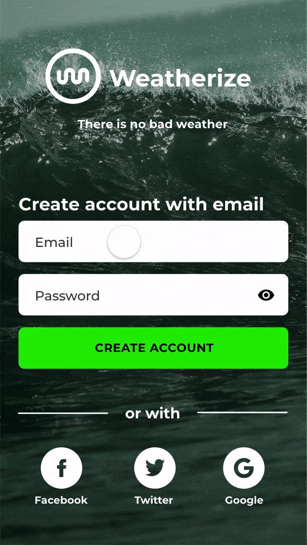
The next step were detailed user flows allowing to establish and define each step of the users navigating through the app in order to fulfil their goals (including potential mistakes/errors they could make on their way). I identified the following three main user tasks and focused the design process around them:
- sign up (create account),
- searching for a location and adding it to favourites,
- checking the weather for a location from favorites for an upcoming weekend.


User Flows
Information Architecture
I repared an initial sitemap based on my personas and their potential flows, as well as my vision for the app. This has been followed by the card sorting to verify my assumptions, and I was happy the confirm that the initial sitemap was correct and it did not require any revisions.

Information Architecture
Iteration
This is the stage of the process, when the initial ideas are transformed into the physical format so that they can be experienced and interacted with by others. These interactions result in feedback that is used to improve the product. It consists of wireframes, prototypes and various kinds of testing.
Wireframes & Prototypes
Keeping in mind the simplicity and the fast access to the weather data, I began sketching the pen & paper low fidelity mobile and desktop wireframes for the three main features of the app (sign up, searching for a location and adding it to favourites and checking the weather for an upcoming weekend for a location from the favourites).
Once I was happy with the flow and navigation on the lo-fi level, I have taken the wireframes to the mid and high-fidelity levels using Adobe XD.


Low-mid-high fidelity wireframes iterations (search for a location and add it to favs).
Test & Share, Iterate, Repeat
I performed a range of activities in order to get the feedback on my work and be able to remove potential problems and friction points as well as learn about any possible improvements. The most important were the Usability Test in order to check whether the users are able to perform the three main tasks on the hi-fidelity prototype. On top of that, I have also run three rounds of the Preference Test to check users' preference to particular elements of the design. Later on, I have shared my work (on the mock-up stage) with my three fellow students (Peer Review), so that they could also give their feedback to my design.
Usability Study
I run six remote tests (using Skype). I was happy to find out that all the participants completed all the tasks with no major frictions and the prototype has been evaluated as very intuitional, clear & simple and "straight to the point". Only some minor areas for improvement have been identified:
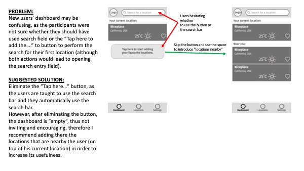
- a bit misleading additional option to search the locations on the dashboard,
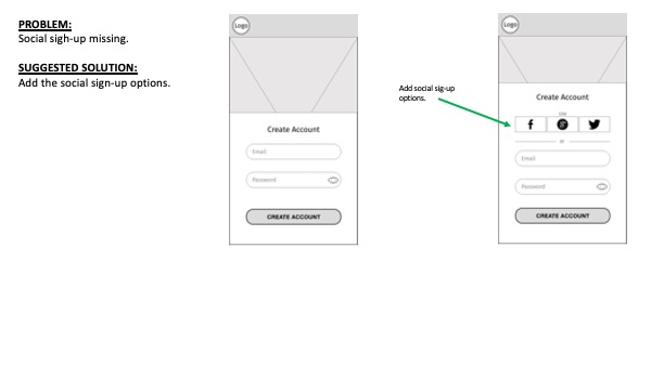
- lacking social log-in option,
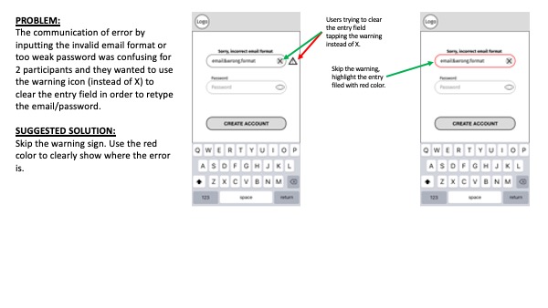
- confusing warning sign by the error message when creating an account,
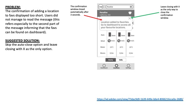
- adding to favs confirmation has been displayed for a too short time,
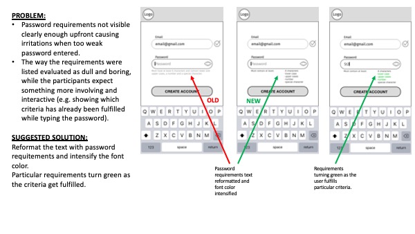
- the way the password requirements displayed not clear enough).
I have used the affinity mapping and the rainbow spreadsheet to analyse the material, identify the learnings and formulate the recommended revisions to the prototype.
Usability Study report
Preference Test
During the three rounds of the Preference Test I have checked users' preference regarding the following elements of the design:
- confirmation of adding a location to favourites,
- general look/style of the sign up screen,
- design of the small location card displayed on the dashboard.
Two of the tests have shown a statistically significant preference for one of the tested options, which I have included in the final version later on. The third one went through another cycle of iterations before getting the final look.
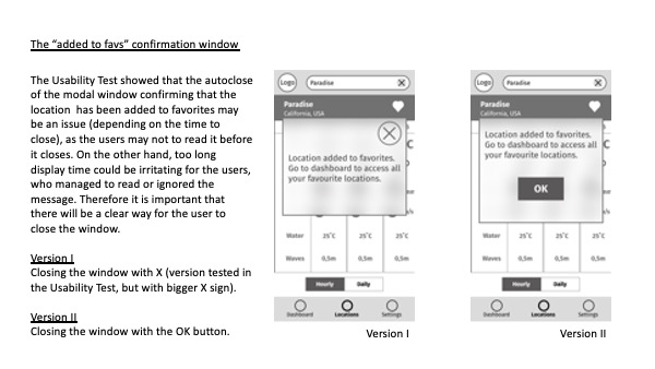
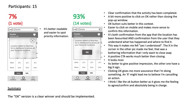
Example of a preference test (confirmation of adding a location to favs)
Peer Review
I have shared my work with three fellow students and asked them to comment on my design. Overall, the feedback was very consistent. The app has been evaluated as very simple, clear and effective. None of the colleagues had any problems with completing the tasks. I have received only very minor comments:
- revision of the social media logos (for the social sign up),
- finding a better way of showing the error message when typing an incorrect email address or too weak password,
- finding a better way to display the password requirements, as they were not visible enough,
- removing unnecessary "X" from the search bar (before the user types in anything),
- increasing the spaces between the search autocomplete results in order to make them easier to select.
Examples of iterations
Below are the exmaples of the design iterations from the very first sketches to the final work for:
- sign-up page
- dashboard
- location page


Examples of iterations
Presentation
This is the stage when the product is ready for the development. It can now be presented "to the world" and and handed over.
Design System
When applying the visual styling to my wireframes, except the fact that the app needs to be clear and the data easy to read, I had in my mind the two following principles:
- the target users are an active & dynamic, "adrenaline driven" group,
- I want to differentiate the app visually from the other weather apps.
Therefore, I decided to give it a sporty "look& feel" (which is used for e.g. sport/sport tracking apps), which not only fulfilled the requirements of being clear and dynamic, bit also allowed to escape from the "sun-blue sky-rain drops" weather apps cliche.

Weatherize Design System.
Animation examples
In order to emphasise the dynamic character of the app, I have designed some simple micro animations for:
- adding a location to favs,
- hourly/daily toggle
- navigation bar.
Examples of microanimations
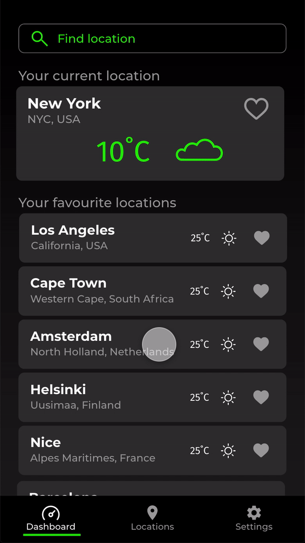
Final mock-ups mobile


Final mobile mock-ups
Final mock-ups desktop


Final desktop mock-ups
The three main tasks
Below is the visualisation of the main three tasks:
- creating an account,
- searching for a location and adding it to favs,
- checking the weather for the upcoming weekend for a location from favs,
performed on the final prototype.
The three main tasks performed on the prototype.